In today’s data-driven world, businesses generate massive amounts of information every second. However, raw data alone holds little value unless it can be understood and interpreted effectively. This is where Data Visualisation Tools & Services play a critical role. They transform complex datasets into visually engaging formats like charts, graphs, dashboards, and reports—making insights easy to understand and act upon.
Whether you are a startup, enterprise, marketer, or analyst, data visualization helps uncover patterns, trends, and correlations that would otherwise remain hidden. With the right tools and services, organizations can make faster, smarter, and more strategic decisions.
n the modern digital landscape, businesses are surrounded by vast amounts of data generated from websites, applications, customer interactions, social media platforms, and operational systems. However, raw data in its original form is often complex, unstructured, and difficult to interpret.
This is where Data Visualisation Tools & Services become essential. These tools transform large volumes of data into visually appealing and easy-to-understand formats such as charts, graphs, dashboards, and infographics. By presenting data visually, organizations can quickly identify patterns, trends, and insights that would otherwise remain hidden in spreadsheets or databases. Data visualization not only simplifies data analysis but also improves decision-making by enabling stakeholders to understand key metrics at a glance. From tracking business performance to analyzing customer behavior, visual data representation plays a crucial role in driving growth and efficiency.
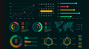
Data visualization is the process of converting raw data into visual formats such as:
These visuals simplify complex data and help users quickly interpret key insights without needing deep technical expertise.
Large datasets can be overwhelming. Visualization tools break down complex information into easy-to-understand visuals.
Clear visuals help decision-makers identify trends, anomalies, and opportunities quickly.
Visual reports make it easier to share insights with teams, stakeholders, and clients.
Instead of analyzing spreadsheets manually, users can instantly understand data through dashboards.
Data-driven decisions lead to improved efficiency, productivity, and profitability.
Modern data visualization tools come with advanced features to enhance usability and performance:
Here are some of the most widely used tools in the industry:
| Tool Name | Key Features | Best For |
|---|---|---|
| Tableau | Advanced analytics, interactive dashboards | Enterprises & analysts |
| Power BI | Microsoft integration, real-time analytics | Business users |
| Google Data Studio | Free tool, easy sharing, cloud-based | Small businesses |
| Qlik Sense | AI-powered insights, self-service analytics | Data professionals |
| D3.js | Custom visualizations using JavaScript | Developers |
| Looker Studio | Data modeling, cloud-based dashboards | Marketing teams |
Custom dashboards are designed to display key performance indicators (KPIs) in a centralized interface.
BI services integrate data visualization with analytics to provide actionable insights.
Automated reports with visual elements for better understanding and presentation.
Combining data from multiple sources into a unified visualization system.
Tailored solutions using technologies like JavaScript, Python, or specialized tools.
Visual representation helps users quickly grasp insights without technical knowledge.
Automated dashboards reduce manual work and improve workflow efficiency.
Access up-to-date data for faster decision-making.
Interactive visuals make data exploration engaging and intuitive.
Businesses that leverage data effectively stay ahead in the market.
Data visualization is used across multiple industries, including:
A structured approach ensures effective results:
Gather data from various sources like databases, APIs, or spreadsheets.
Remove errors, duplicates, and inconsistencies.
Identify trends, patterns, and key metrics.
Choose the right charts and layouts.
Build dashboards and reports using tools.
Ensure accuracy and improve performance.
Selecting the right tool depends on your needs:
Identify whether you need basic charts or advanced analytics.
Choose tools with user-friendly interfaces.
Ensure compatibility with your existing systems.
Select tools that grow with your business.
Consider both free and premium options.
While powerful, data visualization also comes with challenges:
The future of data visualization is evolving rapidly with emerging technologies:
These advancements will make data visualization even more powerful and accessible.
While tools are available, professional services provide:
Outsourcing ensures high-quality results and saves time.
Data Visualization Tools & Services are essential for transforming raw data into meaningful insights. They empower businesses to make informed decisions, improve performance, and stay competitive in a fast-paced digital environment.
By choosing the right tools and leveraging professional services, organizations can unlock the true potential of their data and drive long-term success.
Data visualization tools are software applications that convert raw data into visual formats like charts, graphs, and dashboards.
It helps simplify complex data, improves decision-making, and enhances communication of insights.
Popular options include Tableau, Power BI, and Google Data Studio. The best tool depends on your business needs.
Not always. Many tools offer drag-and-drop interfaces, but advanced customization may require coding.
Healthcare, finance, retail, marketing, education, and logistics all use data visualization.
A dashboard is a visual interface that displays key metrics and data in one place for easy monitoring.
Some tools are free, while others require subscriptions depending on features and usage.
Yes, many tools offer automation features for real-time data updates and reporting.
Data visualization focuses on visuals, while Business Intelligence includes analytics, reporting, and decision-making tools.
Our consultants opt in to the projects they genuinely want to work on.
Contact Us
Extract, manage, and process web data efficiently using secure and scalable cloud-based scraping solutions.
Handle high-volume data extraction with robust, scalable systems built for enterprise-level scraping operations.